How to Create a Website Using React and Framer Motion: Complete Tutorial, Part 2

Hey there! Welcome back to the second part of our tutorial for enthusiastic developers, where we create an engaging website using React with Vite, Typescript, SCSS, and Framer Motion.
Here is a quick breakdown of the topics that we are going to cover in this tutorial:
- Project init, React+Vite, Typescript, and SCSS
- How to add custom fonts and other media
- How to add types and constants
- Basic layout: navbar, logo, arrow, burger
- Buttons to switch between period and subject
- How to add images to the newly created website
- Optimizations: images, lighthouse, cache, preload images
Let us proceed with the development and finally finish this website!
Basic layout: navbar, logo, arrow, burger menu
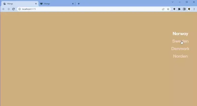
With our foundation laid, we can now start working on UI components. Let’s begin with NavBar and a list of countries. We want to provide an activeCountry and a handler to change that country. The component itself is a <nav> element with a list of mapped countries taken from enums. To apply a CSS class to an active element, we use clsx.
// ./src/components/NavBar/index.tsx

import React, { FC } from 'react';
import clsx from 'clsx';
import { Countries } from '../../constants';
import './NavBar.scss';

interface NavBarProps {
  activeCountry: Countries | null;
  handleCountryChange: (country: Countries) => void;
}

const NavBar: FC<NavBarProps> = ({ activeCountry, handleCountryChange }) => {
  return (
    <nav className="nav-bar">
      <ul className="nav-bar__list">
        {Object.values(Countries).map((country) => (
          <li
            key={country}
            className={clsx('nav-bar__list-item', {
              active: activeCountry === country,
            })}
            onClick={() => handleCountryChange(country)}
          >
            {country}
          </li>
        ))}
      </ul>
    </nav>
  );
};


export default NavBar;
We don’t want to show NavBar on mobile devices; there will be another component for navigation.
/* ./src/components/NavBar/NavBar.scss */

.nav-bar {
  display: none;
  position: fixed;
  top: 20vh;
  right: 4vw;
  z-index: 5;

  @include mq(medium) {
   display: block;
  }

  &__list {
    display: flex;
    flex-direction: column;
    justify-content: center;
    align-items: center;
    padding: 0;
    margin: 0;
    row-gap: 16px;
  }

  &__list-item {
    list-style: none;
    font-size: 28px;
    font-family: $font-main-bold;
    text-decoration: none;
    color: $white;
    opacity: 0.5;
    cursor: pointer;
    transition: opacity 300ms;

    &.disabled {
      pointer-events: none;
    }

    &.active {
      opacity: 1;
    }
  }
}
Now we need to add this component to a Home page:
import React, { FC, useState } from 'react';
import { Countries } from '../constants';
import './Home.scss';

// load lazy
const NavBar = React.lazy(() => import('../components/NavBar'));

interface HomeProps {
  setIsMainImageLoaded: (state: boolean) => void;
}

const Home: FC<HomeProps> = ({ setIsMainImageLoaded }) => {
  const [country, setCountry] = useState<Countries | null>(null);

  const handleCountryChange = (selectedCountry: Countries) => {
    if (country) {
      if (country === selectedCountry) {
        setCountry(null);
      } else {
        setCountry(selectedCountry);
      }
    } else {
      setCountry(selectedCountry);
    }
  };

  return (
    <main className="home">
      <NavBar activeCountry={country} handleCountryChange={handleCountryChange} />
    </main>
  );
};

export default Home;
/* ./src/components/pages/Home.scss */

@use './../styles/abstracts' as *;

.home {
  position: relative;
  width: 100vw;
  height: 100vh;
  height: 100svh;
  overflow: hidden;
}
And then add the Home component to our App component:
import React from 'react';
import Home from './pages/Home';

const App: FC = () => {
  return (
    <>
      <Home />
    </>
  );
};

export default App;
The page should now look like this:
Let’s now create a mobile version of this navigation bar and show it from a burger menu.
// ./src/pages/Home.tsx

//...
  const [isMenuOpen, setMenuIsOpen] = useState(false);
//...
 const handleMenuItemClick = (selectedCountry: Countries) => {
    handleCountryChange(selectedCountry);

    setMenuIsOpen(false);
  };
//...
  return (
    <main className="home">
      <BurgerMenu
        isMenuOpen={isMenuOpen}
        setMenuIsOpen={setMenuIsOpen}
        activeCountry={country}
        handleMenuItemClick={handleMenuItemClick}
      />
	...
    </main>
  );
This is where we start to use Framer Motion – to animate a burger menu. Let’s start with an <AnimatePresence> which animates components when they're removed from the React tree. Any motion components contained in the removed child that have an exit prop will fire that animation before the entire tree is finally removed from the DOM. We must also provide a key prop to any motion component so that AnimatePresence can track their presence in the tree.
// src/components/BurgerMenu/index.tsx

import { AnimatePresence, motion as m } from 'framer-motion';
//...
const BurgerMenu: FC<BurgerMenuProps> = ({
  isMenuOpen,
  setMenuIsOpen,
  activeCountry,
  handleMenuItemClick,
}) => {
  const [isTransition, setIsTransition] = useState(isMenuOpen);

  useEffect(() => {
    setTimeout(
      () => {
        setIsTransition(isMenuOpen);
      },
      isMenuOpen ? 0 : 400
    );
  }, [isMenuOpen]);

  const buttonLineVariants = {
    topAnimate: {
      rotate: isTransition ? '45deg' : 0,
      translate: isTransition ? '2px -6px' : 0,
      backgroundColor: isTransition ? 'black' : 'white',
    },
    bottomAnimate: {
      rotate: isTransition ? '-45deg' : 0,
      translate: isTransition ? '2px 4px' : 0,
      backgroundColor: isTransition ? 'black' : 'white',
    },
  };

  return (
    <div className="burger-menu">
      <div
        className="burger-menu__button-wrapper"
        onClick={() => setMenuIsOpen(!isMenuOpen)}
      >
        <div className="burger-menu__button">
          {[0, 1].map((number) => (
            <m.div
              key={number}
              variants={buttonLineVariants}
              animate={number === 0 ? 'topAnimate' : 'bottomAnimate'}
              transition={{ duration: 0.3 }}
              className="burger-menu__button-line"
            />
          ))}
        </div>
      </div>

      <AnimatePresence>
        {isMenuOpen && (
          <>
            <m.div
              key="menu"
              initial={{ y: '-100%' }}
              animate={{ y: 0 }}
              exit={{ y: '-100%' }}
              transition={{ duration: 0.5 }}
              className="burger-menu__content"
            />
          </>
        )}
      </AnimatePresence>
    </div>
  );
};
Now we need to add the same list of countries that we have in our NavBar. We want each country to fade in and out one by one with a delay
// src/components/BurgerMenu/index.tsx

//...
<AnimatePresence>
        {isMenuOpen && (
          <>
		//...
            <ul className="burger-menu__list">
              {Object.values(Countries).map((country, index, countryArray) => (
                <m.li
                  key={country}
                  initial={{ opacity: 0 }}
                  animate={{
                    opacity: 1,
                    transition: { duration: 0.5, delay: 0.15 + index / 10 },
                  }}
                  exit={{
                    opacity: 0,
                    transition: {
                      duration: 0.3,
                      delay: (countryArray.length - 1) / 10 - index / 10 - 0.2,
                    },
                  }}
                  className={clsx('burger-menu__list-item', {
                    active: country === activeCountry,
                  })}
                  onClick={() => handleMenuItemClick(country)}
                >
                  <span
                    className={clsx('burger-menu__list-item-text', {
                      active: country === activeCountry,
                    })}
                  >
                    {country}
                  </span>
                </m.li>
              ))}
            </ul>
          </>
        )}
      </AnimatePresence>
//...

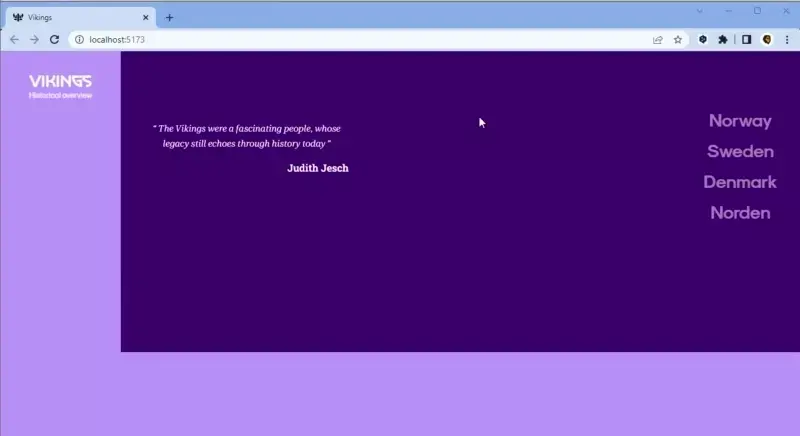
And we need to add a logo for our site and give it a transition from white to black when the menu is open.
// src/components/Logo/index.tsx
...
    <m.div
      initial={{ color: 'white' }}
      animate={{ color: isTransition ? 'black' : 'white' }}
      transition={{ duration: 0.5 }}
      className="logo"
    >
      {isTransition ? (
        <LogoBlackIcon className="logo__icon" />
      ) : (
        <LogoWhiteIcon className="logo__icon" />
      )}
      <p className="logo__subtitle">Historical overview</p>
    </m.div>
...
// src/pages/Home.tsx
...
    <main className="home">
      <Logo isMenuOpen={isMenuOpen} />
	  ...
    </main>
...
Buttons to switch period and subject
Now we need to prepare for animating blocks with images. We created a simple div with changeable colors and strings about Vikings to show. Let's call it InfoItem and add it to the Home component:
// src/pages/InfoItem/index.tsx

...
const InfoItem: FC<InfoItemPropsInterface> = ({
  variants,
  primaryColor,
  secondaryColor,
  imagePath,
  imagePathSmall,
  textBlocks,
}) => {
  return (
    <section
      className="page"
      style={{ backgroundColor: primaryColor }}
    >
      <div className="page__content">
        <div
          className="page__content-bg"
          style={{ backgroundColor: secondaryColor }}
        >
        </div>
      </div>
      <article className="page__article">
        {Object.keys(textBlocks).map((position) => (
          <div
            key={position}
            className="page__text-block"
          >
            {textBlocks[position as keyof typeof textBlocks].map((text) => (
              <p key={text} className="page__text">
                {text}
              </p>
            ))}
          </div>
        ))}
      </article>
    </section>
  );
};

export default InfoItem;
// src/pages/Home.tsx

const [currentInfo, setCurrentInfo] = useState<InfoItemInterface | null>(
    null
  );
const [
    infoAnimationVariablesSlideFromRight,
    infoAnimationVariablesSlideFromLeft,
    infoAnimationVariablesSlideFromTop,
  ] = useInfoAnimationVariables(period.name);

const [infoAnimationVariant, setInfoAnimationVariant] = useState<Variants>(
    infoAnimationVariablesSlideFromRight
  );

...
      <AnimatePresence>
          <InfoItem
            key={currentInfo.imagePath}
            variants={infoAnimationVariant}
            primaryColor={currentInfo.primaryColor}
            secondaryColor={currentInfo.secondaryColor}
            imagePath={currentInfo.imagePath}
            imagePathSmall={currentInfo.imagePathSmall}
            textBlocks={currentInfo.textBlocks}
          />
      </AnimatePresence>
...
With added styles, it looks like this:
Now we need to add some motion to these blocks. We need to change our elements in the InfoItem component to those from Framer Motion:
// src/pages/InfoItem/index.tsx
import { motion as m, Variants } from 'framer-motion';
...
<m.section
      variants={variants}
      initial="mainInitial"
      animate="mainAnimate"
      exit="mainExit"
      className="page"
      style={{ backgroundColor: primaryColor }}
    >
      <div className="page__content">
        <m.div
          variants={variants}
          initial="contentBgInitial"
          animate="contentBgAnimate"
          exit="contentBgExit"
          className="page__content-bg"
          style={{ backgroundColor: secondaryColor }}
        >
        </m.div>
      </div>
      <article className="page__article">
        {Object.keys(textBlocks).map((position) => (
          <m.div
            key={position}
            variants={variants}
            custom={position === 'left' ? 1 : 1.1}
            initial="textInitial"
            animate="textAnimate"
            exit="textExit"
            className="page__text-block"
          >
            {textBlocks[position as keyof typeof textBlocks].map((text) => (
              <p key={text} className="page__text">
                {text}
              </p>
            ))}
          </m.div>
        ))}
      </article>
    </m.section>
...

Let’s now add a period switcher for Viking Age and Assimilation and a slightly different animation for switching these periods. At this point, we’ve added a new component called PeriodItem and we added it to the Home component.
// src/pages/PeriodItem/index.tsx

const PeriodItem: FC<PeriodItemProps> = ({
  isFirstAppear,
  isLeftSection,
  periodAnimateX,
  nextColors,
  isCountry,
  primaryColor,
  secondaryColor,
  imagePath,
  imagePathSmall,
  imagePathPlaceholder,
  quotationText,
  quotationAuthor,
  setIsMainImageLoaded,
}) => {
  const { width } = useWindowSize();
  const isSlideAfterCountry = periodAnimateX === '-100%';
  const imageSrcDependingOnScreen =
    width > BreakPoints.EXTRA_SMALL ? imagePath : imagePathSmall;
  const neededImageSrc = width !== 0 ? imageSrcDependingOnScreen : null;


  const variants = {
    mainInitial: {
      x: isLeftSection ? '-100%' : periodAnimateX,
    },
    mainAnimated: {
      x: 0,
      transition: {
        x: {
          ease: TRANSITIONS.EASE.slide,
          delay: isSlideAfterCountry
            ? 0.2
            : TRANSITIONS.DELAY.slide - SHIFT_DELAY,
          duration: TRANSITIONS.DURATION.slide,
        },
      },
    },
    mainExit: {
      x: isLeftSection || isCountry ? '-100%' : '100%',
      backgroundColor: nextColors.primaryColor,
      transition: {
        x: {
          ease: TRANSITIONS.EASE.slide,
          delay: isCountry ? SHIFT_DELAY : TRANSITIONS.DELAY.slide,
          duration: TRANSITIONS.DURATION.slide,
        },
        backgroundColor: {
          delay: isCountry ? 0.2 : TRANSITIONS.DELAY.backgroundColor,
          duration: TRANSITIONS.DURATION.backgroundColor,
        },
      },
    },
    contentInitial: {
      width: isLeftSection ? '85vw' : '100vw',
    },
    contentAnimated: {
      clipPath: isLeftSection ? 'inset(0 0 0 0)' : 'inset(0 0 0 15%)',
      transition: {
        delay: isSlideAfterCountry ? 0 : 0.9,
        duration: isSlideAfterCountry ? 0 : 0.8,
      },
    },
    contentBgInitial: {
      clipPath:
        isSlideAfterCountry || isLeftSection
          ? 'inset(0 0 0 100%)'
          : 'inset(0 0 0 0)',
    },
    contentBgAnimated: {
      clipPath: 'inset(0 0 0 0)',
      transition: {
        clipPath: {
          ease: TRANSITIONS.EASE.slide,
          delay: isSlideAfterCountry || isFirstAppear ? 0.2 : 0.5,
          duration: 1.1,
        },
      },
    },
    contentBgExit: {
      clipPath:
        !isCountry && !isLeftSection
          ? 'inset(0 100% 0 0)'
          : 'inset(0 0 0 100%)',
      backgroundColor: nextColors.secondaryColor,
      transition: {
        clipPath: {
          ease: TRANSITIONS.EASE.slide,
          duration: isSlideAfterCountry ? 1 : 0.95,
        },
        backgroundColor: {
          delay: isCountry ? 0.2 : TRANSITIONS.DELAY.backgroundColor,
          duration: TRANSITIONS.DURATION.backgroundColor,
        },
      },
    },
    quotationInitial: {
      x: '-100%',
      opacity: 0,
    },
    quotationAnimated: {
      x: 0,
      opacity: 1,
      transition: {
        duration: 0.5,
        delay: isFirstAppear ? 0.5 : 1,
      },
    },
    quotationExit: {
      x: '-100%',
      opacity: 0,
      transition: {
        duration: 0.5,
      },
    },
  };


  return (
    <m.section
      variants={variants}
      initial={isFirstAppear ? undefined : 'mainInitial'}
      animate="mainAnimated"
      exit="mainExit"
      className="page"
      style={{ backgroundColor: primaryColor }}
    >
      <m.div
        variants={variants}
        initial="contentInitial"
        animate="contentAnimated"
        className="page__content right"
      >
        <m.div
          variants={variants}
          initial="contentBgInitial"
          animate="contentBgAnimated"
          exit="contentBgExit"
          className="page__content-bg right"
          style={{ backgroundColor: secondaryColor }}
        >
        </m.div>
      </m.div>
      <m.blockquote
        key={quotationText}
        variants={variants}
        initial="quotationInitial"
        animate="quotationAnimated"
        exit="quotationExit"
        className="page__quotation"
      >
        <p className="page__quotation-text">{quotationText}</p>
        <p className="page__quotation-author">{quotationAuthor}</p>
      </m.blockquote>
    </m.section>
  );
// src/pages/Home.tsx
...
 	<AnimatePresence>
        {!currentInfo ? (
          <PeriodItem
            key={period.imagePath}
            isFirstAppear={isFirstAppear}
            isLeftSection={period.name === Periods.Viking}
            isCountry={!!country}
            periodAnimateX={periodAnimateX}
            nextColors={periodPageNextColors}
            primaryColor={period.primaryColor}
            secondaryColor={period.secondaryColor}
            imagePath={period.imagePath}
            imagePathSmall={period.imagePathSmall}
            imagePathPlaceholder={period.imagePathPlaceholder}
            quotationText={period.quotationText}
            quotationAuthor={period.quotationAuthor}
            setIsMainImageLoaded={setIsMainImageLoaded}
          />
        ) : (
          <InfoItem
            key={currentInfo.imagePath}
            variants={infoAnimationVariant}
            primaryColor={currentInfo.primaryColor}
            secondaryColor={currentInfo.secondaryColor}
            imagePath={currentInfo.imagePath}
            imagePathSmall={currentInfo.imagePathSmall}
            textBlocks={currentInfo.textBlocks}
          />
        )}
      </AnimatePresence>
...

Images
Now that we have our basic layout and animations ready, we can add images to the site. We can simply add <img> elements to our PeriodItem and InfoItem
// src/pages/InfoItem/index.tsx
...
     <img
        srcSet={`${imagePathSmall}, ${imagePath} 2x`}
        src={imagePath}
        className="image"
        alt="vikings info img"
      />
      <div className="page__content">
        <m.div
          variants={variants}
          initial="contentBgInitial"
          animate="contentBgAnimate"
          exit="contentBgExit"
          className="page__content-bg"
          style={{ backgroundColor: secondaryColor }}
        >
          <img
            srcSet={`${imagePathSmall}, ${imagePath} 2x`}
            src={imagePath}
            className="image"
            alt="vikings info img"
          />
        </m.div>
      </div>
...
/* src/pages/Home.scss */

.image {
  width: 100%;
  height: 100%;
  object-fit: cover;
  opacity: 50%;
}

Optimizations: images, lighthouse, cache, preloaded images
At this point, our work is almost finished, but we still have some optimization issues we need to address.
First, we need to change image file extensions to more progressive ones instead. We used Cloud Convert, but you can use any other tool to convert .png to .webp
We also created a component to preload all images that are used and cache them so that they are not loaded in real-time.
// src/components/ImagesLoader/index.tsx

const ImagesLoader: FC<PeriodSwitcherProps> = ({ urls }) => {
  const cacheImages = (imagesSrs: string[]) => {
    imagesSrs.map((src: string) => {
      return new Promise(() => {
        const img = new Image();
        img.src = src;
      });
    });
  };

  useEffect(() => {
    if (urls) {
      cacheImages(urls);
    }
  }, [urls]);

  return null;
};

export default ImagesLoader;
// src/App.tsx
...
  return (
    <>
      <Home setIsMainImageLoaded={setIsMainImageLoaded} />
      <ImagesLoader urls={urls} />
    </>
  );
Summary
Throughout this tutorial, we evolved from a blank canvas to a fully developed, engagingly animated website dedicated to Vikings, explaining the ins and outs of our development process with React, Vite, Typescript, SCSS, and Framer Motion.
As you might have noticed, creating complex interactions and animations with this set of technologies can be challenging, but the versatility and power it offers in return is remarkable. It might seem daunting at first, but with accumulating knowledge and experience, the process becomes smoother.
Embarking on this journey has been an enriching experience, and your patience throughout has been highly appreciated. We hope this guide has addressed all your queries along the way. Thanks for accompanying us, and we look forward to our next venture together!
You can check out the final result here. Also check out our repo for this project on GitHub.
Have a look at other our articles

08.01.2025
How to create an Animated cursor pointer in ReactIn this tutorial, we'll walk through the process of creating an animated cursor pointer in a React application. Animated cursor pointer can add a unique and interactive element to your website, enhancing the user experience. While we'll rely on React and the Framer Motion library to implement this effect, the primary enchantment will come from straightforward CSS.Read more
24.12.2023
Agile vs Waterfall Software Development Methods: 7 Key DifferencesAgile and Waterfall are the two most prominent methods in the software development industry today. Although they are both solid and offer the most practical way to finish a project as quickly as possible, they're different in many ways. Here are 7 of them.Read more
22.12.2023
How to Build a Tool for Generating Linear and Radial Gradients with React: Complete Tutorial, Part 3Hello! Welcome back to part three of our tutorial for excited developers. In this tutorial, We'll use React for our app, utilize the react-colorful library for color manipulation, add smooth animations with framer-motion, ensure type safety with TypeScript, and style our app using Sass.Read more